Back in the saddle again...
If I can remember how to do this, I'm going to ease back into posting.
For Gary who asked for an updated state-country GDP map:
[Here for the interactive source]
Showing posts with label geography. Show all posts
Showing posts with label geography. Show all posts
Monday, November 07, 2011
Wednesday, February 23, 2011
Not quite a total time-suck...
But close. Check out this interactive map of counties that displays dozens of different demographic, economic and ag statistics. This one shows percent of farm operators over 65, for example.


But close. Check out this interactive map of counties that displays dozens of different demographic, economic and ag statistics. This one shows percent of farm operators over 65, for example.

[Click to embiggen]
Powerful graphics tools like this often show patterns, trends, oddities, and simple surprises you would not notice in a table of numbers. Here's a population rate of change showing how IL counties are essentially depopulating unless you have a university, medical or other government powerhouse - or are a collar county.

The more I use tools like this, the less I am certain about my own home and community. We see it from too close up for real perspective.
Find your own revelatory map and send me a screen shot/link and I'll post it.
Wednesday, October 13, 2010
This works for my brain...
A new way to depict maps.
 [More]
[via sullivan]
A new way to depict maps.
Most city maps are insufferably hard to read. Street names are never big enough, map keys are too complicated, and neighborhoods are rarely delineated; you could wander into the heart of West Oakland and never know it, if not for the symphony of Glocks going off around the corner.
A clutch of city maps by the Hewitt, Texas-based cartography firm Axis Maps offers a clever solution. The maps use typography as the sole visual clue. So everything from streets and highways to parks and waterways are labeled with text. The bigger the thoroughfare or the landmark, the bigger the words. So far they have maps of Chicago and Boston; New York, SF, and DC are coming up. Chicago's shown here:

[via sullivan]
Thursday, July 22, 2010
We're all Number One...
At something. A little self-esteem boosting for the globe.

[Note in the tiny print: "Mostly % of population" (per capita) data].
[Source]
At something. A little self-esteem boosting for the globe.

[Note in the tiny print: "Mostly % of population" (per capita) data].
[Source]
Thursday, June 17, 2010
Coming or going?...
A really cool map of residence changes between counties. (I chose Champaign county rather than my own because all the changes in my county were to nearby communities.)
 [Try your own county here]
And an even cooler land cover map.

(Click on viewer button)
(Thanks, Jan)
A really cool map of residence changes between counties. (I chose Champaign county rather than my own because all the changes in my county were to nearby communities.)

And an even cooler land cover map.
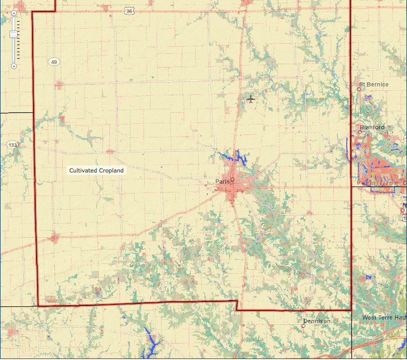
(Click on viewer button)
(Thanks, Jan)
Sunday, March 07, 2010
On Wisconsin!...
Places where bars outnumber grocery stores.


[via sullivan]
Places where bars outnumber grocery stores.

FloatingSheep, a fun geography blog, looks at the beer belly of America. One maps shows total number of bars, but the interesting map is the one above. Red dots represent locations where there are more bars than grocery stores, based on results from the Google Maps API. The Midwest takes their drinking seriously.
Of course there are plenty of possible explanations for the distribution. Maybe people get all their food from superstores like Walmart in the red dot areas, so there are fewer gigantic stores than there are small local bars.
Then again, the FlowingSheep guys did their homework and found, according to Census, that the number of drinking places in those red dots are really skewed compare to the average. So it's also possible that area of the country just likes to drink a lot. [More]
Update: The comment below reminded me of this map that bounced around the blogosphere as few weeks ago: Europe's Alcohol Belts

This map shows Europe dominated by three so-called ‘alcohol belts’, the northernmost one for distilled spirits, a middle one for beer and the southernmost one for wine. Each one’s existence and extension is determined by a mix of culture and agriculture.
The Wine Belt covers the southern parts of Europe, where wine has historically been an important industry and an everyday commodity: the whole of Portugal, Spain, Italy, Montenegro, Greece, Macedonia, Bulgaria, Hungary, Moldova and Georgia; all but the northwestern zone of France; and significant parts of Switzerland, the Czech Republic, Slovakia, Croatia, Serbia, and Romania. [More]
[via sullivan]
Tuesday, December 22, 2009
Great satellite photos...
Be sure to read the explanations for the colors for each picture.


[via rgs]
Be sure to read the explanations for the colors for each picture.

Garden City, Kansas – Center pivot irrigation systems create red circles of healthy vegetation in this image of croplands near Garden City, Kansas.

West Fjords – The West Fjords are a series of peninsulas in northwestern Iceland. They represent less than one-eighth the country’s land area, but their jagged perimeter accounts for more than half of Iceland’s total coastline.[More]
[via rgs]
Monday, August 31, 2009
But do they have dilithium crystals?...
Behold a place you never knew existed: Salar de Uyuni in Bolivia.


The search for energy will take us to strange places. This could be one of them.
Behold a place you never knew existed: Salar de Uyuni in Bolivia.
And with plug-in cars gaining traction (heh), the need for lithium in batteries could be significant.
This place is immense. It is over twelve thousand square kilometers in area, which makes it the largest salt flat in the world. To give an idea, that is over twenty five times larger than the more famous Bonneville Salt Flats in the United State. It also has the distinction of being the highest salt flats in the world at three thousand seven hundred meters above sea level. The mounds in this first picture are not, as you may first suspect, a naturally occurring phenomena. The hand of man is at work here....
Coincidentally the major minerals to be found in salt are halite and gypsum. One use of halite is to keep ice off our pathways and roads while gypsum is used as a finish for walls and ceilings - you probably know it as drywall. There are also considerable stocks of lithium in the salar, which are used in the production of batteries and certain pharmaceuticals. However, Bolivia as a nation exports none at the moment. It does not want large multinationals muscling in and is preparing to develop its own strategies to ‘mine’ the lithium.

Like other batteries, those that use lithium work by shuttling ions (electrically charged atoms or groups of atoms) between their electrodes. When they’re charging, the ions travel in one direction. When they’re discharging, they go in the other. The most widely used have a positive electrode made from cobalt or manganese oxide and a negative electrode made from graphite. The electrolyte (the material through which the ions pass from one electrode to the other) is a lithium-based gel or polymer. These types of batteries are mainly used in laptops, and are not well-suited for the automotive environment, where they’re subject to rapid discharging and recharging, much higher power demands and extremes of heat and cold. The problem is that the chemistry isn’t stable enough, so batteries suffer from overheating—and that can have an explosive effect.
The most promising electrode chemical makeups, then, involve nano-engineered materials like phosphates of iron, lithium-titanate spinel and, most recently, bundles of silicon nanowires. Making an electrode out of these tiny particles increases the available surface area for the ions to bond to and exchange electrons, avoiding a bottleneck that used to result in deformation (and diminished effectiveness) of traditional materials like graphite. The smoother-flowing electrode decreases the battery’s internal resistance and improves its ability to store and deliver energy. [More]
The search for energy will take us to strange places. This could be one of them.
Sunday, June 07, 2009
The anchor responsibility...
Though we have trouble seeing it, the recession in the US appears more manageable or at least, less severe than in many other countries.

And the primary reason suggested by Stratfor Global Intelligence verifies an intuition I struggled to find logic to prove. We are at the heart a national economy based on the land we occupy.
Moreover, many farmers (as opposed to livestock producers) have been sheltered from the worst effects of the recession by government actions. I find it hard to swallow, therefore, that we continue to seek "victimhood" status and qualifiy for yet more public aid.
Instead, we could be a voice of reassurance "speaking comfortably" to fellow Americans about the solid state of the bedrock of our economy. We could be acting the role of a reliable, responsible industry that can carry the nation on our shoulders through a difficult time.
While this sounds grandiose, it lifts our own spirits and gives more purpose to our lives than counting our relatively minor problems, I think.
Though we have trouble seeing it, the recession in the US appears more manageable or at least, less severe than in many other countries.

And the primary reason suggested by Stratfor Global Intelligence verifies an intuition I struggled to find logic to prove. We are at the heart a national economy based on the land we occupy.
This idea should give farmers pause. We are one of the major anchors tying our nation to the physical space we inhabit. Ergo, we are the link that makes this national asset productive, along with others like transportation and extraction workers, of course.The most important aspect of the United States is not simply its sheer size, but the size of its usable land. Russia and China may both be similar-sized in absolute terms, but the vast majority of Russian and Chinese land is useless for agriculture, habitation or development. In contrast, courtesy of the Midwest, the United States boasts the world’s largest contiguous mass of arable land — and that mass does not include the hardly inconsequential chunks of usable territory on both the West and East coasts.Second is the American maritime transport system. The Mississippi River, linked as it is to the Red, Missouri, Ohio and Tennessee rivers, comprises the largest interconnected network of navigable rivers in the world. In the San Francisco Bay, Chesapeake Bay and Long Island Sound/New York Bay, the United States has three of the world’s largest and best natural harbors. The series of barrier islands a few miles off the shores of Texas and the East Coast form a water-based highway — an Intracoastal Waterway — that shields American coastal shipping from all but the worst that the elements can throw at ships and ports.The real beauty is that the two overlap with near perfect symmetry. The Intracoastal Waterway and most of the bays link up with agricultural regions and their own local river systems (such as the series of rivers that descend from the Appalachians to the East Coast), while the Greater Mississippi river network is the circulatory system of the Midwest. Even without the addition of canals, it is possible for ships to reach nearly any part of the Midwest from nearly any part of the Gulf or East coasts. The result is not just a massive ability to grow a massive amount of crops — and not just the ability to easily and cheaply move the crops to local, regional and global markets — but also the ability to use that same transport network for any other economic purpose without having to worry about food supplies.The implications of such a confluence are deep and sustained. Where most countries need to scrape together capital to build roads and rail to establish the very foundation of an economy — transport capability — geography granted the United States a near-perfect system at no cost. That frees up U.S. capital for other pursuits and almost condemns the United States to be capital-rich. Any additional infrastructure the United States constructs is icing on the cake. (The cake itself is free — and, incidentally, the United States had so much free capital that it was able to go on to build one of the best road-and-rail networks anyway, resulting in even greater economic advantages over competitors.) [More]

Moreover, many farmers (as opposed to livestock producers) have been sheltered from the worst effects of the recession by government actions. I find it hard to swallow, therefore, that we continue to seek "victimhood" status and qualifiy for yet more public aid.
Instead, we could be a voice of reassurance "speaking comfortably" to fellow Americans about the solid state of the bedrock of our economy. We could be acting the role of a reliable, responsible industry that can carry the nation on our shoulders through a difficult time.
While this sounds grandiose, it lifts our own spirits and gives more purpose to our lives than counting our relatively minor problems, I think.
Sunday, May 03, 2009
Where evil is...
Finally, researchers have brought GPS to morality. Behold, the Seven Deadly Sins all mapped out for easy locating.

Finally, researchers have brought GPS to morality. Behold, the Seven Deadly Sins all mapped out for easy locating.
The darker a county, the more evil it is.(Save this for your vacation planning.)
Greed was calculated by comparing average incomes with the total number of inhabitants living beneath the poverty line. On this map, done in yellow, Clark County is bile (see map on Page 2).
Envy was calculated using the total number of thefts — robbery, burglary, larceny and stolen cars. Rendered in green, of course, Clark County is emerald.
Wrath was calculated by comparing the total number of violent crimes — murder, assault and rape — reported to the FBI per capita. Vought and his colleagues used the color red to illustrate wrath, so Clark County looks like a fresh welt. Washoe is slightly statistically duller. Everywhere else is a friendly pork pink.
Lust was calculated by compiling the number of sexually transmitted diseases — HIV, AIDS, syphilis, chlamydia and gonorrhea — reported per capita. Here again, Clark and Washoe counties are worst. Carson City County is a close third.
Gluttony was calculated by counting the number of fast food restaurants per capita, and this is one category where Clark County is bested. First in deep fry goes to Carson City.
Sloth was calculated by comparing expenditures on arts, entertainment and recreation with the rate of employment. Here again Clark County is beat, scoring only average on the scale of sloth.
And pride, lastly, is most important. The root of all sins, in this study, is the aggregate of all data. Vought and his Kansas colleagues combined all data from the six other sins and averaged it into an overview of all evil. [More]
How to best see where naughtiness resides:
- Click [More] link above
- Click the symbol in the lower right hand corner of the "Nationwide" Map
- Use the FWD/BACK arrows to navigate, ESC to exit.
They are doing some stuff right...
Another reason I (and other observers) mention Denmark frequently.
Another reason I (and other observers) mention Denmark frequently.
Friday, September 19, 2008
Hey, the TomTom just went blank!...
Want to drive from North America to South America? Seems there is a 54-mile problem.

Want to drive from North America to South America? Seems there is a 54-mile problem.
You might have wondered if it's possible to drive between North and South America - for surely there must be a road between these two continents! Well, as it turns out, there is absolutely NO ROAD connecting them, and all travel advisories clearly says "Don't Go", even if you feel somewhat suicidal. I am talking about the wild and wildly dangerous Darien Gap. [More]Send me a postcard.
Friday, August 08, 2008
The Earth rocks...
Dude! Like, I mean the actual rocks.

*Who says old farmers can't be happening daddy-o's?
(What? Really? When did it stop being cool?)
[via andrew sullivan]
Dude! Like, I mean the actual rocks.
*Gnarly.

The result of a collaboration between 100 organizations spanning over 70 countries, OneGeology marks the first international effort to strip the Earth to its core to unveil its underlying geological features. The series of maps available on the website allows users to identify the different types of rocks by color.
Maps and geological data are available for 29 countries so far, with more to come in the near future. According to Nature's Katrina Charles, one aim of the project is to help make mineral extraction opportunities easier to find -- a hook that made several countries, including Brazil, Australia and Canada, eager to take part. [More]
*Who says old farmers can't be happening daddy-o's?
(What? Really? When did it stop being cool?)
[via andrew sullivan]
Friday, February 08, 2008
If I walk due southwest for a really long time...
Or for that matter, a straight line in any direction? Where would I go?

(Here's the answer for my farm)
Better yet what if I dug a really deep hole?
[via InformationNation]
Or for that matter, a straight line in any direction? Where would I go?

Tired to walk on the same places everyday? Everytime you go walk, you don't know where to go? So... Walk in a straight line! It's very easy and you will never get lost, because you always will arrive in the start point after walk around the whole world. :-) [More][OK - so the authors are from outta town - it's still a cool mashup]
(Here's the answer for my farm)
Better yet what if I dug a really deep hole?
[via InformationNation]
Monday, November 19, 2007
Another reason to learn where Bulgaria is...

A map of where the richest farmland in Europe is. [Click on map for details][May load slow, BTW]
A little help with the above map, in case your Eastern Europe memory is a little hazy. Where countries are:
 Hmm - I'm looking for big production numbers to start coming out of Ukraine.
And in case you have forgotten about loess -
Meanwhile, to refresh your knowledge about how money gets distributed under the EU Common Agricultural Policy and more detail about the individual countries, try this helpful site.
I think the EU may point the way on farm program reform. What if they "unilaterally disarm" first?
[Return to AgWeb]

A map of where the richest farmland in Europe is. [Click on map for details][May load slow, BTW]
Leipzig. A new map showing the distribution of loess sediments in Europe has been published for the first time in 75 years, in digital format. With this map, Dagmar Haase, a geographer at the Helmholtz Centre for Environmental Research (UFZ), has completed the work of various researchers who had begun as far back as the 1970s and 80s to revise the last comprehensive inventory produced by Rudolf Grahmann, which appeared in Mitteilungen der Gesellschaft für Erdkunde in Leipzig in 1932. Haase and her colleagues have produced the new map with a scale of 1:2,500,000 with the help of modern digital information systems. [More]
A little help with the above map, in case your Eastern Europe memory is a little hazy. Where countries are:
 Hmm - I'm looking for big production numbers to start coming out of Ukraine.
And in case you have forgotten about loess -
Whether they are lime-grey or dark black, loess sediments and the soils derived from them are of special importance for agriculture worldwide because they are some of the most fertile soils there are. In Germany, soil quality is given a rating using an index. The maximum value of 100 was attributed to the loess soil at Eickendorf in the Magdeburger Börde plains.When people say they aren't making any more farmland, they are right. But what happens when really good land that has been abused or underutilized finally gets farmed well?
Loess sediments and their soils cover around one-tenth of the earth. In Europe, loess is a powdery product of glaciations during the Ice Age. During those cold periods, this very fine, light material was swept from bare regions on the edges of the glaciers and deposited in regions with denser vegetation. Loess consists largely of quartz grains and lime. The very fine grains ensure good aeration, water storage and mineral levels. This means that soils derived from loess are very fertile, like the black earth of the Börde plains, but are also particularly susceptible to erosion. It is therefore important to know where exactly these fertile soils so worthy of protection are to be found.
Meanwhile, to refresh your knowledge about how money gets distributed under the EU Common Agricultural Policy and more detail about the individual countries, try this helpful site.
I think the EU may point the way on farm program reform. What if they "unilaterally disarm" first?
Additionally, the European Union uses 87 percent of the world's export subsidies, which severely disadvantages U.S. exports. The U.S. utilizes only 3 percent and the rest of the world uses the remaining 10 percent.People who routinely use the language of war to describe entitlement payments to a handful of farmers likely have never served in the military with real armaments or have children who now face them. The 2007 Farm Bill is not a war - Iraq is - and evoking the language of death and conflict for political advantage is contemptible and dismissive of the very real threat of very real armaments, IMHO.
“Farmers and ranchers are willing to lower farm program payments via WTO negotiations if — and only if — they can secure increased opportunities to sell their products overseas,” said Stallman. “However, we are not willing to unilaterally disarm.” [More]
[Return to AgWeb]
Subscribe to:
Posts (Atom)